How to Calculate Average Revenue: ARPU & ARPA for SaaS In
Ayush Soni
Founder, Revcover

On this page
- Why Your Average Revenue Metric Might Be Misleading
- What usually goes wrong
- What a useful average revenue metric should do
- ARPU vs ARPA Choosing Your North Star Metric
- Start with the base formula
- Choose the metric that matches your business model
- Average Revenue Metrics at a Glance
- Calculating Average MRR and ARR for Subscriptions
- Use recurring revenue as the numerator
- Define active customers before you publish the metric
- Build the metric from billing events, not spreadsheet patches
- The Critical Difference Between ARPU and ARPPU
- Why freemium companies get fooled
- When ARPPU should lead the conversation
- Adjusting Calculations for Churn and Recovered Revenue
- Booked revenue is not the same as kept revenue
- A practical resilient revenue formula
- Segmenting Average Revenue for Deeper Insights
- The segments that actually change decisions
- A simple SQL pattern for cohort analysis
- A spreadsheet version for smaller teams
You're probably looking at a dashboard right now that says average revenue is steady, maybe even improving, and still feeling uneasy. New signups are coming in, churn looks tolerable, and Stripe is collecting money. But the number doesn't quite line up with what your team is seeing in renewals, downgrades, failed payments, and save offers.
That tension is normal. A single average revenue metric often hides the operational reality underneath it. It can blur the line between healthy monetization and temporary stability. It can also miss something growth teams care about: not just the revenue you booked, but the revenue you kept.
If you want to know how to calculate average revenue in SaaS, start with the formula. Then get much stricter about the denominator, the reporting window, and the revenue leakage that sits between an invoice and actual retained revenue.
Why Your Average Revenue Metric Might Be Misleading
Average revenue looks clean on a chart. That's exactly why teams trust it too quickly.
A blended number can hide plan mix changes, downgrades, failed renewals, and free-user dilution all at once. If you only watch one top-line average, you can miss whether growth is coming from better monetization, a few larger accounts, or simple denominator changes.
For SaaS leaders, this matters because pricing, packaging, lifecycle messaging, and retention programs all depend on what the metric is measuring. If finance is using account-based averages, product is using all active users, and growth is reporting only paying customers, everyone is “right” and the business still gets a distorted picture.
What usually goes wrong
Three mistakes show up repeatedly:
- Blended populations: Teams mix free users, trial users, paying users, and multi-seat accounts into one denominator.
- Mismatched timing: Revenue comes from one period, while user or account counts come from another.
- Revenue leakage blindness: Failed payments and cancellation saves affect the numerator, but many dashboards don't explain how.
Practical rule: If you can't explain who is counted, what revenue is included, and which period both belong to, the metric isn't decision-ready.
The main issue isn't the formula itself. The issue is that average revenue becomes a vanity metric when it isn't tied to the way the business sells and retains customers.
What a useful average revenue metric should do
A usable metric should help you answer operational questions:
- Are higher-value plans expanding?
- Are free users diluting your user-based average?
- Did a failed-payment spike lower revenue even though customer demand stayed intact?
- Did retention work preserve revenue that the standard report treats as lost?
That's why a new Head of Growth shouldn't ask only, “What's our average revenue?” The better question is, “Average revenue per what, over which period, and after what kind of leakage?”
ARPU vs ARPA Choosing Your North Star Metric
The fastest way to misread average revenue is to use the wrong unit.
Some companies should think in users. Others should think in accounts. In SaaS, those aren't interchangeable. A self-serve app with one person per subscription behaves differently from a B2B platform where one customer account may include many users, seats, workspaces, or billing contacts.
Start with the base formula
The foundational formula is simple: Average Revenue = Total Revenue / Quantity. Workday's example shows revenues of $5,000, $7,000, and $6,000 across 3 units, for a total of $18,000, which produces an average revenue of $6,000 per unit when divided by 3, as explained in Workday's overview of the average revenue formula.
In SaaS, that same logic becomes one of two common metrics:
- ARPU = Total Revenue / Total User Count
- ARPA = Total Revenue or Total MRR / Total Active Customers
The hard part isn't the math. It's choosing the denominator that reflects how value is sold.
Choose the metric that matches your business model
If you sell to individuals, ARPU is usually the cleaner starting point. Think consumer subscriptions, creator tools, or lightweight self-serve products where one person is the billable entity.
If you sell to companies, ARPA is usually more useful. One account may have multiple seats, admins, departments, or subsidiaries. A user-based average can make a healthy account look weaker than it is because the account is the commercial unit, not the seat.
A lot of B2B teams drift into ARPU because product analytics is user-centric. That's convenient, but it can lead growth teams to optimize onboarding or activation for users while missing the pricing and expansion behavior of accounts.
A simple test helps. Ask what your sales team negotiates, what finance invoices, and what customer success renews. If the answer is “accounts,” ARPA should probably be your operating metric.
You should also keep ARPPU in view when you have a free tier or a mixed user base. That metric uses only paying customers in the denominator, which makes it better for understanding monetization efficiency.
Teams tracking retention alongside revenue should also keep an eye on account expansion and contraction patterns. In this context, net dollar retention analysis often adds needed context around what your average revenue metric is missing.
Average Revenue Metrics at a Glance
| Metric | Formula | Best For |
|---|---|---|
| ARPU | Total Revenue / Total Users | User-led products and individual subscriptions |
| ARPA | Total Revenue or Total MRR / Total Active Customers | B2B SaaS with account-based selling |
| ARPPU | Total Revenue / Total Paying Customers | Freemium or mixed-tier SaaS where free users would dilute ARPU |
The goal isn't to crown one metric as universally correct. The goal is to pick the one that best matches the economic unit you manage.
Calculating Average MRR and ARR for Subscriptions
A familiar month-end problem looks like this. New bookings were solid, several accounts expanded, and the dashboard still reports a healthy average revenue number. Then finance closes the books and the picture changes because failed payments were never recovered, a few “saved” cancellations stayed in the base, and your active-customer count did not line up with the revenue cutoff.
That is why average MRR or ARR needs to be built from recurring revenue logic, not from a generic average revenue formula.

Use recurring revenue as the numerator
For subscription businesses, the working formula is usually Average MRR per account = Total MRR / Total Active Customers.
That gives growth, finance, and customer success a shared operating metric. It also keeps one-time setup fees, services revenue, and other cash events from distorting the number. If the goal is to understand the value of the subscription base, the numerator should reflect recurring revenue only.
ARR is the same logic on an annual basis. Use it when planning, budgeting, or reporting at the board level. Use MRR for operating decisions. MRR shows plan changes, downgrades, failed renewals, and recovery activity faster, which makes it more useful for weekly or monthly execution.
The trade-off is straightforward. ARR is cleaner for annual planning. MRR is better for seeing what changed.
Define active customers before you publish the metric
The denominator causes more reporting errors than the formula itself.
Teams often remove a customer from the active count as soon as a cancellation is submitted, while the revenue side still includes that account through the end of the billing term. The reverse happens too. An account in payment retry may stay in the customer count even though recurring revenue has already been written down internally. Both choices can make average revenue look better or worse than the business is.
Write down your rule set. Do not leave it to whoever builds the spreadsheet or dashboard.
A workable definition of active customer should specify how you treat:
- Mid-period cancellations
- Scheduled cancellations at period end
- Past-due subscriptions still in dunning or retry
- Paused subscriptions
- Annual contracts billed manually
- Accounts recovered after failed payments
- Accounts retained through cancellation save flows
That last pair gets ignored in too many guides. Recovered revenue and saved subscriptions are part of the operating reality of recurring revenue. If an account was headed toward churn and your billing or retention process kept it paying, average revenue should reflect that outcome based on your reporting cutoff, not on the earlier failure event.
For teams aligning billing timing with accounting treatment, it helps to understand how deferred revenue works in subscription reporting.
Build the metric from billing events, not spreadsheet patches
If Stripe is your billing source of truth, calculate average MRR or ARR from subscription and invoice data, then reconcile against customer status rules.
A practical workflow looks like this:
- Pull recurring subscription revenue for the reporting period.
- Count active customers using the same period cutoff and status definitions.
- Exclude non-recurring charges if you are measuring subscription average revenue.
- Reconcile upgrades, downgrades, cancellations, retries, and recoveries before publishing the metric.
- Document the treatment of saved cancellations and recovered failed payments so growth and finance report the same number.
That last step matters more than it gets credit for. I have seen teams celebrate ARPA growth that came from denominator cleanup while missed payment recovery was falling unnoticed. I have also seen the opposite. A recovery program improved retained MRR, but the dashboard still treated those accounts as churned for part of the month, which understated average revenue and masked real progress.
Here's a useful walkthrough on subscription revenue concepts before you formalize the metric in your warehouse or dashboard:
A good average MRR or ARR metric is repeatable, auditable, and tied to billing reality. It should show not only what you booked, but also what you kept from slipping away.
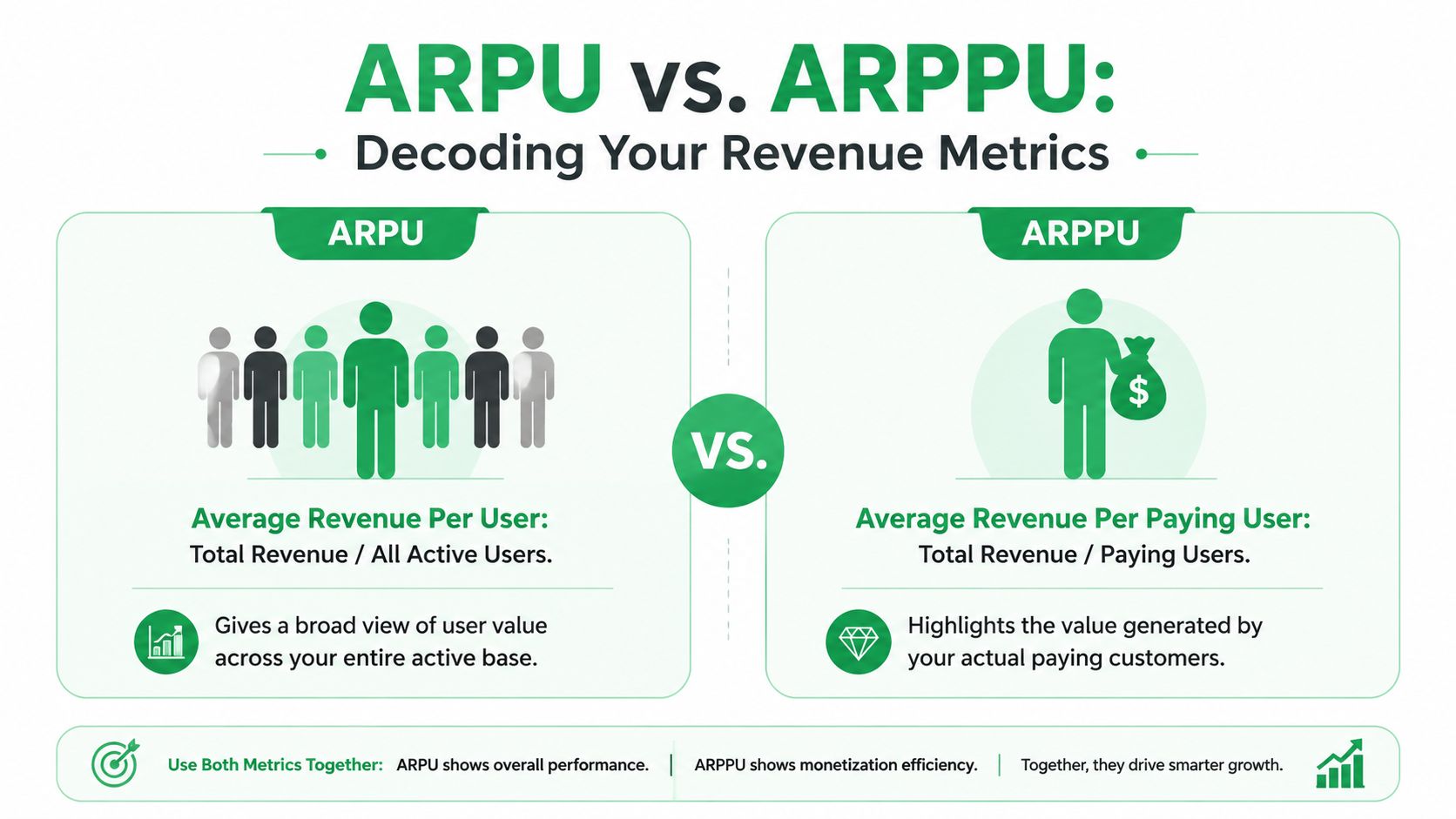
The Critical Difference Between ARPU and ARPPU
In freemium and product-led SaaS, average revenue gets distorted fast.
If you include every active user in the denominator, ARPU can look weaker than your monetization is. That doesn't mean ARPU is useless. It means it answers a different question than many teams think it does.
Why freemium companies get fooled
Many guides define ARPU using total users, but they don't separate active users from paying users. That gap matters. Indeed's explanation of average revenue highlights that ARPPU means Total Revenue / Total Paying Customers, and that using a broader user base can obscure the value of paying customers in freemium models, as noted in Indeed's breakdown of average revenue metrics.
In practice, ARPU tells you how much revenue your full user base generates on average. ARPPU tells you how much revenue your paying base generates on average. Those are not competing metrics. They answer different strategic questions.
Consider a typical product-led setup:
- A large free tier drives adoption.
- Only a subset converts to paid.
- Paying accounts may expand over time.
- Product usage is broad, but monetization is concentrated.
In that environment, ARPU often becomes a blended demand-and-monetization metric. ARPPU is a cleaner monetization metric.
If your growth team is working on conversion, paywall design, or package upgrades, ARPPU is usually more actionable than ARPU.
When ARPPU should lead the conversation
Use ARPPU when you need to understand the quality of your paying base. It's especially useful for:
- Freemium products: Free users can swamp the denominator.
- Mixed acquisition models: Paid campaigns may drive signups that don't monetize at the same rate as product-led users.
- Pricing reviews: ARPPU shows whether paying customer value is moving after packaging changes.
- Expansion analysis: It helps separate growth in monetization from growth in user volume.
Use ARPU when the business question is broader. For example, if you want to know whether the overall product ecosystem is getting more valuable per active user, ARPU is still helpful.
The mistake is presenting ARPU as if it were the best measure of monetization efficiency. For many SaaS businesses, it isn't. ARPPU is the metric that tells you whether the people who pay are becoming more valuable.
Adjusting Calculations for Churn and Recovered Revenue
Most average revenue reporting treats lost revenue as final. That's too simplistic for subscription businesses.
Revenue can leave in more than one way. Customers can cancel intentionally. Payments can fail without customer intent. A save flow can preserve a downgrade instead of a full churn event. A dunning sequence can recover a past-due subscription after the first charge fails. If your metric ignores those mechanics, it understates the health of retention work.
Booked revenue is not the same as kept revenue
Standard average revenue formulas don't account for involuntary churn. Paddle notes that 10% to 30% of churn comes from failed payments, and cites more recent data showing 28% of SaaS churn is involuntary, which creates a major blind spot when teams calculate average revenue from reported collections alone in its discussion of revenue formula blind spots.
That distinction matters operationally.
If a card expires and a subscription falls into failed-payment status, your customer may still want the product. But your revenue numerator drops anyway. ARPU or ARPA then falls, and the dashboard suggests weakening monetization when the underlying issue is billing recovery.
Voluntary churn creates a similar reporting problem from the opposite direction. If a customer enters a cancellation flow and accepts a pause, a downgrade, or a save offer, that retained revenue often gets buried inside net subscription changes instead of being made visible as preserved value.
Track what was billed, what was collected, what was at risk, and what was recovered. If you collapse those into one revenue number, you lose the operational story.
For teams tightening their retention reporting, a clear churn rate calculation formula helps align customer loss, revenue loss, and recovery activity.
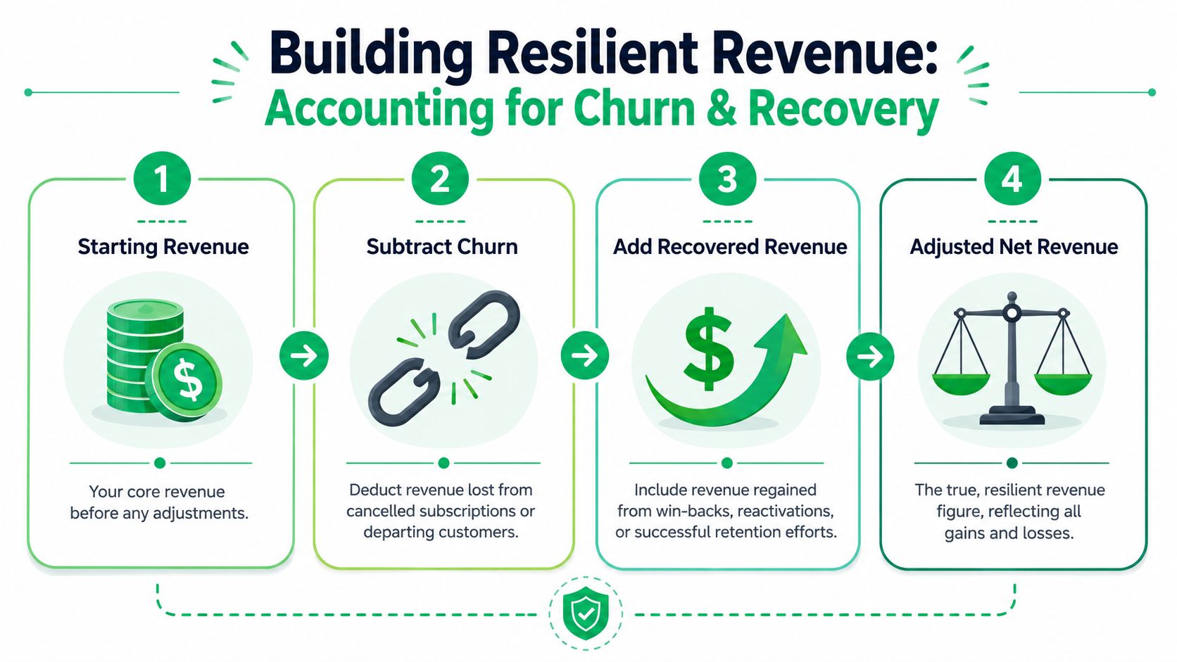
A practical resilient revenue formula
For subscription businesses, I like using a second operating metric alongside standard ARPA:
Effective ARPA = (Collected or retained recurring revenue after churn and recovery adjustments) / Active customer base
That's not a replacement for your finance-approved metric. It's an operating lens for growth, retention, and RevOps.
A resilient framework usually includes these components:
- Starting recurring revenue: Your baseline recurring revenue for the period.
- Subtract churned revenue: Include full cancellations and meaningful contractions if that's how your team manages retention.
- Subtract failed-payment leakage: Separate this from voluntary churn so billing issues don't get mixed with customer intent.
- Add recovered revenue: Include successfully recovered failed payments and cancellation saves that preserved recurring revenue.
This approach gives you a better read on whether revenue weakness comes from pricing, product fit, billing friction, or retention execution.
It also changes team behavior. When recovered revenue is visible inside the average revenue conversation, growth and retention teams stop treating saves and payment recovery as side projects. They become part of the core monetization system.
Segmenting Average Revenue for Deeper Insights
A single average is a summary. It's not a diagnosis.
Once you know how to calculate average revenue correctly, the next step is segmentation. That's where the metric starts helping you make decisions about pricing, channel quality, retention, and expansion.

The segments that actually change decisions
The most useful cuts are the ones tied to action.
- By pricing tier: This shows whether premium plans are expanding, entry plans are compressing, or discounting is skewing the mix.
- By acquisition cohort: You can see whether newer customers monetize differently from older ones.
- By acquisition channel: This helps separate high-volume signups from high-quality revenue.
- By region or market: Useful when packaging, billing norms, or buyer behavior differ.
Founderpath notes that for enterprise SaaS, tracking cohort-based ARPU can lead to 30% higher retention by surfacing revenue leakage earlier, and recommends ARPU_cohort = Cohort Revenue / Cohort User Count segmented by acquisition month in its cohort-based SaaS growth discussion.
That's one of the cleanest ways to stop arguing over blended averages. A cohort view shows whether revenue changes come from customer quality, expansion, churn, or a shift in your go-to-market mix.
A simple SQL pattern for cohort analysis
If your data sits in a warehouse, start simple. You don't need a giant model to get useful segmentation.
WITH customer_cohorts AS (
  SELECT
    customer_id,
    DATE_TRUNC('month', first_paid_at) AS cohort_month
  FROM customers
),
revenue_by_month AS (
  SELECT
    customer_id,
    DATE_TRUNC('month', revenue_date) AS revenue_month,
    SUM(mrr) AS mrr
  FROM subscription_revenue
  GROUP BY 1,2
)
SELECT
  c.cohort_month,
  r.revenue_month,
  SUM(r.mrr) AS cohort_revenue,
  COUNT(DISTINCT r.customer_id) AS active_customers,
  SUM(r.mrr) / COUNT(DISTINCT r.customer_id) AS arpa_cohort
FROM customer_cohorts c
JOIN revenue_by_month r
  ON c.customer_id = r.customer_id
GROUP BY 1,2
ORDER BY 1,2;
This won't solve every edge case. It will get you a working cohort view that finance, growth, and success can all inspect.
A spreadsheet version for smaller teams
If you're not in SQL every day, a sheet works fine as long as definitions are locked down.
A practical setup:
- One tab with customer ID, acquisition month, plan, channel, region.
- One tab with monthly recurring revenue by customer.
- A pivot table grouping by cohort month and plan.
- A calculated field dividing revenue by distinct customers in each segment.
Don't segment everything at once. Start with the cuts your team can act on this quarter.
For most SaaS teams, that means plan tier, acquisition cohort, and paying status first. Those three views usually expose more than a polished blended dashboard ever will.
If your team wants a clearer view of revenue that was saved, not just booked, Revcover is built for that job. It connects with Stripe, helps manage cancellation flows and failed-payment recovery, and ties outcomes back to recovered recurring revenue so growth, support, and RevOps can measure what retention work preserved.