
Customer Retention Analytics: A 2026 Guide for SaaS

Ayush Soni
Founder, Revcover
On this page
- Why Most Retention Strategies Underperform
- Busy work often looks like retention work
- Lagging metrics hide where money is leaking
- Defining Customer Retention Analytics as a System
- A dashboard is not a system
- The three operating layers
- The Core Metrics That Actually Drive Growth
- What each metric should tell you
- A practical metric table
- Don't confuse movement with impact
- Advanced Analyses to Pinpoint Churn Drivers
- Start with cohorts, not averages
- Pair behavior with stated intent
- Build prediction only after instrumentation is clean
- Instrumenting a Modern Retention Data Stack
- What to instrument at the moment of intent
- What standard stacks usually miss
- From Insights to Revenue Actionable Reporting
- What a useful retention report includes
- Reporting by intervention, not by channel
A SaaS business with 10,000 customers and an average annual churn rate of 5.8% loses 580 subscribers a year, according to Flowlu's customer retention statistics roundup. That's the number that should reframe customer retention analytics for many businesses. Retention isn't a reporting exercise. It's a revenue control system.
Too many companies still treat churn as a monthly KPI review item. They watch a line go up or down, discuss onboarding, maybe launch a save discount, and move on. That approach misses the point. Useful customer retention analytics connects three things in one loop: what users did, why they decided to leave, and how much revenue a specific intervention saved.
Why Most Retention Strategies Underperform
Retention strategies often underperform because teams measure churn after the revenue is gone instead of building a process to prevent it.
The pattern is easy to spot. Product owns usage data. Finance owns contraction and cancellations. Support owns complaint history. Success owns renewals. Marketing owns win-back campaigns. Each team can show useful reporting, but revenue still leaks when those signals never meet in one workflow.
The problem is not a lack of dashboards. It is a lack of intervention logic tied to revenue outcomes.
Many teams also treat churn rate as the final answer. In practice, churn rate is a summary metric. It tells you loss occurred, but it does not show which accounts were drifting, what friction triggered the decision, what the customer said on the way out, or whether a save attempt preserved recurring revenue. Without that chain, retention becomes reporting instead of management.
That gap gets expensive fast. As noted earlier, keeping existing customers is usually far cheaper than replacing them through acquisition. Teams that accept churn as a routine cost of growth often end up funding preventable revenue loss with a larger acquisition budget.
Busy work often looks like retention work
A lot of common retention activity creates the appearance of control while leaving the underlying problem untouched:
- Lifecycle emails sent to every at-risk account the same way, regardless of contract size, product usage, or cancellation reason.
- Cancellation flows that collect no structured feedback, so the team knows a customer left but not why.
- NPS reviews disconnected from account value, which makes sentiment interesting but hard to prioritize.
- Feature adoption charts with no owner or playbook, so a usage drop gets noticed and then ignored.
These are reporting artifacts, not a closed-loop retention system.
A useful retention report should answer three questions with precision: who was at risk, why they were leaving, and which action saved revenue. If it cannot do that, the team is tracking activity rather than managing outcomes.
Lagging metrics hide where money is leaking
Top-line churn still matters, but it is too blunt to guide action on its own. A rise in churn can come from poor onboarding, weak product fit for a specific segment, unresolved support issues, payment failures, or discount-sensitive customers reaching renewal. Those problems require different interventions, different owners, and different success criteria.
Many retention programs often break down due to a critical gap. Quantitative metrics explain what changed. Qualitative feedback explains why the customer made the decision. Teams need both in the same system if they want to attribute recovered revenue to the right fix. Otherwise, they end up offering blanket discounts, over-crediting win-back campaigns, or solving for the loudest complaint instead of the biggest source of loss.
Strong retention work changes the operating cadence. Teams stop asking why churn was high last month and start monitoring which accounts show risk signals now, which cancellation reasons are clustering, and which save actions protect revenue without training customers to expect concessions.
That is the difference between a retention program that looks busy and one that saves money.
Defining Customer Retention Analytics as a System
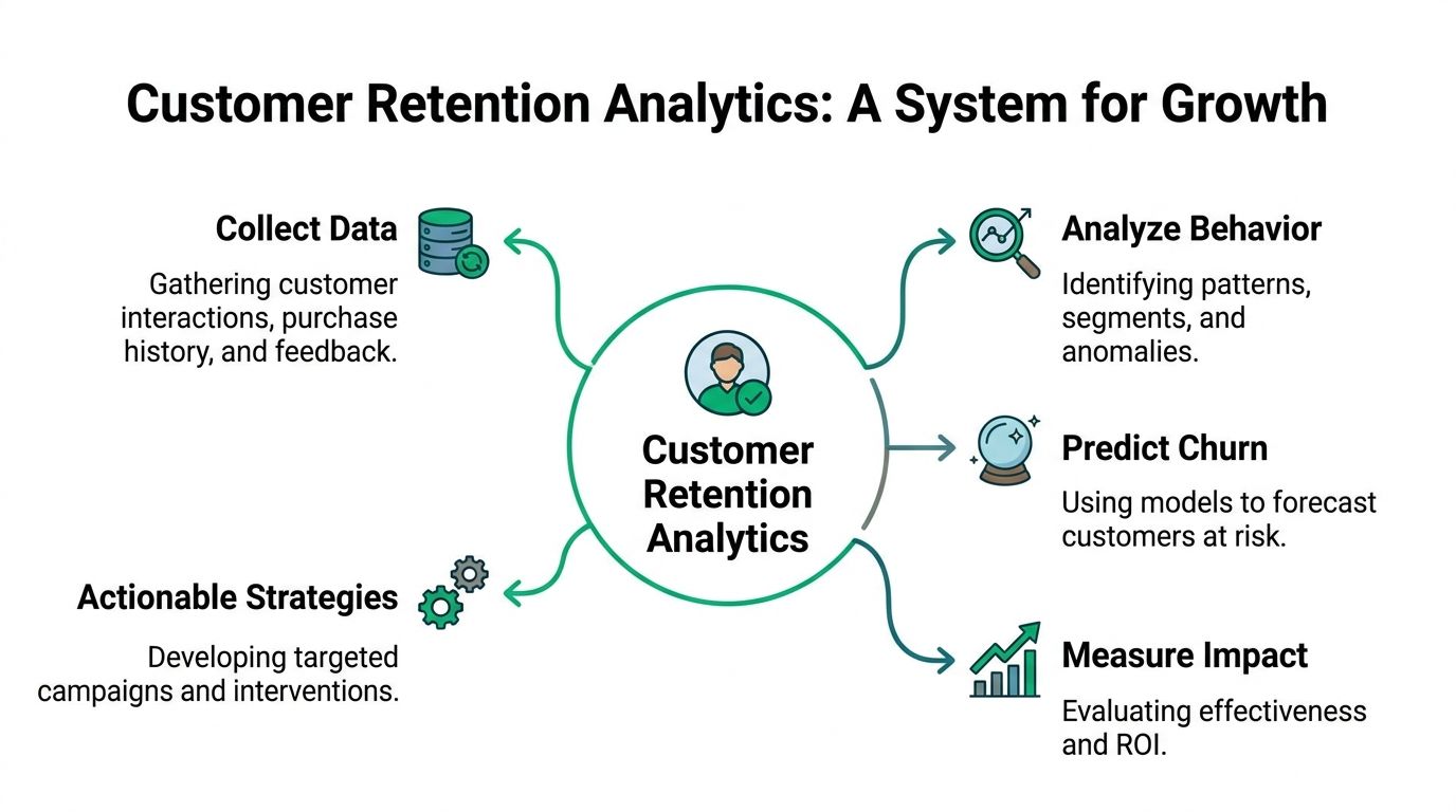
Customer retention analytics works best when you treat it like a revenue immune system. It detects threats early, diagnoses the cause, triggers a response, and records whether the response worked.
A dashboard is not a system
A dashboard tells you where to look. A system tells you what to do next.
That distinction matters because retention failure usually happens across handoffs. Product tracks engagement. Support tracks tickets. Billing tracks failed payments. Success tracks renewals. Marketing tracks win-back campaigns. If those signals stay in separate tools, nobody owns the full churn loop.
In practice, customer retention analytics should answer five operational questions:
- Who is showing risk signals
- What changed in their behavior
- Why they say they're leaving
- What intervention they saw
- Whether that intervention preserved revenue or not
If one of those questions is missing, the loop breaks.
The three operating layers
The most useful way to structure the system is in three layers.
Signal detection
This layer watches for behavioral and commercial signals that suggest a customer is drifting. Examples include declining login frequency, incomplete onboarding, reduced feature usage, unanswered support issues, plan downgrade interest, or failed payments.
The job here isn't to collect every event possible. It's to identify the handful of signals that reliably precede cancellation for your business model. B2B SaaS products often learn more from depth of usage and support friction than from simple logins.
Root cause analysis
At this point, most stacks fall apart. Teams can often see that a user's activity declined, but they can't connect that decline to the reason the account chose to cancel.
Root cause analysis combines quantitative behavior with qualitative intent. Usage data might show a drop in feature adoption. Cancellation feedback might reveal “missing integration,” “budget freeze,” or “too complex for the team.” Those are different problems, and they require different responses.
Good retention analysis separates symptom from cause. Low usage is often the symptom. The cause is usually something operational, product-related, or commercial.
Intervention and attribution
This layer turns insight into action. If the issue is temporary budget pressure, a pause or downgrade may make sense. If it's poor activation, a support handoff may outperform a discount. If it's a billing problem, recovery logic matters more than persuasion.
Attribution is what makes this a business system rather than a support workflow. You need to know which interventions led to accepted offers, which ones delayed churn without preventing it, and which ones created healthy retained accounts.
A functioning system doesn't just reduce churn. It teaches the company which problems are worth fixing, which accounts are worth saving, and which interventions produce durable recurring revenue.
The Core Metrics That Actually Drive Growth
Most retention dashboards are crowded with numbers that look complex but don't help anyone make a decision. The useful metrics are the ones that tell a Head of Growth what action to take next.
One of the clearest examples is Customer Lifetime Value. ACR Journal's retention analysis reports that increasing CLV by 10% can boost overall revenue by 20% to 30%. That's why retention metrics should be tied to value, not just logos retained. Keeping a low-value, low-fit customer at any cost isn't the same as improving the economics of the business.
What each metric should tell you
A useful retention metric has a job.
Customer churn rate answers whether logo retention is deteriorating. It's a health indicator, but it's blunt. If churn moves, you still need segmentation to know whether the problem sits with a plan tier, cohort, onboarding path, or billing segment.
Revenue churn rate tells you whether the dollars leaving are concentrated in high-value accounts. In many SaaS businesses, this is more important than customer churn count. Losing one large account can matter more than a batch of small ones.
CLV tells you how much future value your current retention system is protecting. It's one of the best bridges between product behavior and finance.
Net Revenue Retention is where growth leaders get a reality check. Expansion can mask retention weakness for a while, but it won't fix a product that repeatedly loses fit after onboarding or contract renewal.
For teams refining activation and engagement signals, this guide to engagement metrics that reflect real product value is a useful complement to retention reporting.
A practical metric table
| Metric | What It Measures | Why It Matters for Growth |
|---|---|---|
| Customer churn rate | The share of customers who leave in a given period | Shows whether logo retention is improving or weakening |
| Revenue churn rate | The recurring revenue lost from churned or downgraded accounts | Reveals whether high-value accounts are slipping away |
| Customer Lifetime Value | The long-term revenue value of a retained customer | Helps teams prioritize retention work that protects future revenue |
| Net Revenue Retention | Revenue retained after churn, contraction, and expansion | Shows whether the business is compounding or replacing lost ground |
| Save offer acceptance rate | How often a specific intervention is accepted | Helps compare discounts, pauses, downgrades, and support-led saves |
| Recovered MRR | Revenue preserved through a successful intervention | Connects retention tactics directly to financial outcomes |
Don't confuse movement with impact
Teams often celebrate improvement in proxy metrics that never become revenue outcomes. More logins, higher email open rates, and more survey responses are useful context. They aren't the destination.
The stronger test is whether your metric helps make one of these calls:
- Fix the product because a churn theme keeps appearing in valuable accounts.
- Change the save path because the current offer attracts low-intent retention.
- Reroute billing recovery because payment-related losses need a different workflow than voluntary cancellations.
- Focus a success team on accounts where retained value justifies human intervention.
That's the difference between a dashboard full of numbers and a measurement system that drives growth.
Advanced Analyses to Pinpoint Churn Drivers
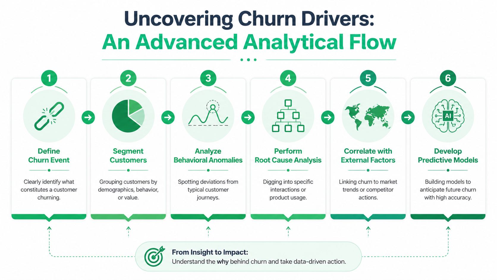
Once the core metrics are stable, the substantive work begins. You need analyses that isolate causes, not just patterns. That usually means moving beyond aggregate charts and asking what changed for specific groups before they churned.
Start with cohorts, not averages
Average retention hides too much. Cohort analysis is often the first place real churn drivers become visible.
Group customers by something meaningful: signup month, plan type, acquisition source, team size, or activation status. Then compare how their retention curves diverge. If one onboarding cohort decays faster than the one before it, you probably shipped a process or product change that affected early value realization. If one plan tier churns after a pricing adjustment, that's a commercial issue, not a product one.
This kind of analysis is simple, but it forces discipline. Instead of saying “retention softened,” you can say “accounts that never completed onboarding step X behave differently from those that did.”
Pair behavior with stated intent
Behavioral analytics tells you what happened before churn. It rarely tells you why the customer made the final decision. That's where free-text feedback becomes valuable.
A good churn driver analysis doesn't stop at labels like “price” or “missing feature.” It clusters cancellation reasons into themes, then ties those themes back to product behavior and account value. If customers citing implementation complexity also showed low feature adoption and repeated support friction, you're looking at an activation problem. If customers citing budget concerns were still active, your issue may be packaging or contract structure instead of product value.
For teams building that layer, this walkthrough on customer feedback analysis for retention decisions is useful because it shows how unstructured reasons can be operationalized.
The best churn analysis combines the product trail with the customer's own words. If those two stories disagree, trust neither until you investigate.
Build prediction only after instrumentation is clean
Predictive models are useful, but they only work when the underlying event data is trustworthy and the intervention paths are clear.
GetThematic's overview of retention analytics notes that predictive analytics can identify at-risk customers up to 30 days before churn, and that targeted interventions can reduce voluntary churn by 15% to 25% in B2B SaaS environments. Those are meaningful gains, but only if the signals feeding the model are relevant.
Focus on signals that have operational consequence:
- Behavioral decline such as reduced logins or lower feature usage
- Implementation friction like incomplete onboarding steps
- Support drag including unresolved tickets
- Commercial signals like downgrade exploration or payment failures
A lot of teams jump straight to scoring models and skip the hard part, which is defining the actual churn event, cleaning event taxonomy, and deciding what intervention should follow each risk state. Prediction without routing logic creates alerts. It doesn't create saves.
Instrumenting a Modern Retention Data Stack
A modern retention stack has one job: make churn legible while there's still time to act. That sounds obvious, but most setups are built for reporting after the fact.
A typical SaaS stack already has the raw materials. Stripe holds subscription state and billing history. Product analytics tools capture event behavior. A CRM stores account context. Support tools log friction. The missing piece is usually the moment of intent. That's where you learn why the customer is leaving and what save path makes sense.
What to instrument at the moment of intent
Cancellation is not just a billing action. It's a high-signal product event.
When a user enters a cancellation flow, the system should capture context before presenting a response. That includes plan, tenure, account value, recent usage direction, billing state, and stated reason. If the customer says they're leaving because they no longer need the product, that should route differently from “missing feature,” “budget pressure,” or “switching to a competitor.”
This is also where many teams lose the most insight. Quantum Metric's discussion of customer retention analytics highlights that up to 40% of churn is unexplained because companies track when users leave but don't systematically capture why through in-product exit surveys at the point of intent.
That blind spot creates bad prioritization. Product teams overreact to the loudest anecdote. Growth teams discount accounts that needed a downgrade. Success teams chase churn manually without context.
What standard stacks usually miss
Standard BI tools such as Tableau or Power BI are good at visualization. They're not built to orchestrate intervention inside the churn flow itself. That's why teams often end up with disconnected systems: one tool for charts, another for surveys, another for billing, and a spreadsheet to reconcile the outcomes.
The problem isn't lack of data. It's lack of timing and linkage.
A well-instrumented retention stack should connect:
- Subscription data from Stripe or the billing source of truth
- Behavioral data from product analytics tools
- Reason data captured inside cancellation and downgrade flows
- Outcome data showing which route led to retention, pause, downgrade, recovery, or clean cancellation
If your cancellation flow only confirms the cancellation, you're wasting the best retention signal in the business.
There's also a practical trade-off here. More fields and more branching can increase insight, but they can also make the flow feel obstructive. The better pattern is short, honest capture. Ask for the reason, use the account context already available, and present one or two relevant next steps. Don't turn a cancellation into an interrogation.
For billing-related churn, the same principle applies. Failed payment recovery should be instrumented as a retention workflow, not treated as a back-office collections task. The billing event, reminder path, card update action, and recovery outcome all belong in the same retention dataset if you want a full revenue picture.
From Insights to Revenue Actionable Reporting
Good retention reporting answers one question clearly: what revenue did this action preserve?
That sounds basic, but many dashboards still stop at churn rate, cancellation count, or survey theme frequency. Useful reporting goes further. It ties intervention, reason, and account context to a measurable revenue outcome.
What a useful retention report includes
The first view should be operational, not decorative. A Head of Growth needs to see which churn reasons are rising, which save offers are being accepted, which accounts recovered after failed payments, and where lost MRR is concentrating.
Exadel's write-up on data-driven retention strategy points to a key challenge here: leaders struggle to measure the incremental revenue recovered from specific save offers such as discounts or pauses. The right reporting model separates recovered MRR from specific interventions from lost MRR from clean cancellations so teams can solve the attribution problem instead of guessing.
That kind of dashboard changes the conversation. “Discounts work” becomes “discounts work for this segment, on this plan, for this stated reason, with this downstream retention quality.”
Reporting by intervention, not by channel
A practical retention dashboard usually needs at least these layers:
- Reason-level reporting that groups cancellation intent into themes tied to account value
- Intervention reporting that compares pause, downgrade, discount, support handoff, and clean cancellation outcomes
- Recovery reporting for failed payments, including retries, reminders, and card updates
- Segment reporting by plan, customer value, product usage pattern, or billing status
For teams trying to structure this correctly, a clear revenue attribution model for retention and recovery helps separate true saves from revenue that would have remained anyway.
The reporting should also expose trade-offs. Some interventions preserve revenue quickly but attract weak-fit customers who churn later. Others save fewer accounts but preserve healthier revenue. Without this layer, teams often overinvest in tactics that look effective in the first week and disappoint over time.
A short product walkthrough helps make that operating model more concrete:
The strongest retention reporting does something simple but uncommon. It gives product, growth, support, and finance a shared language. Product sees which issues drive preventable churn. Growth sees which offers preserve recurring revenue. Finance sees what was recovered. Support sees where human intervention changes outcomes.
That's when customer retention analytics stops being a metric category and starts functioning as a revenue system.
If you want to operationalize that closed loop, Revcover is built for subscription SaaS teams that need to capture churn reasons at the point of intent, coordinate save offers and payment recovery, and tie outcomes back to recovered monthly recurring revenue. It fits alongside Stripe Billing, keeps cancellation flows measurable, and gives growth teams a way to see what effectively saves revenue instead of just what generates activity.