SaaS Engagement Metrics: Predict Churn & Recover Revenue
Ayush Soni
Founder, Revcover
On this page
- Beyond Vanity Metrics Why Most Engagement Is Noise
- Engagement should predict a business outcome
- The short list that deserves executive attention
- The SaaS Engagement Metrics That Actually Matter
- Engagement should predict a business outcome
- The short list that deserves executive attention
- How to Measure and Instrument Key Metrics
- Start with events, not dashboards
- Build a score only if it changes action
- Benchmarks and How to Interpret the Signals
- Benchmarks are context, not targets
- How to read movement instead of snapshots
- Actionable Playbooks for Engagement Signals
- Map the signal to the intervention
- What works better than a generic cancel flow
- Unifying Your Revenue Recovery Loop with Revcover
- One system beats disconnected tools
- How the loop closes in practice
- Common Pitfalls and How to Get Started
- The mistakes that keep teams stuck
- A practical starting point
Most advice on engagement metrics is backwards. It starts with dashboards, then asks teams to admire activity. More page views. More sessions. More clicks. More opens. None of that matters if the behavior doesn't tell you who will renew, who will churn, and where you can save revenue before it leaves.
In SaaS, engagement isn't a branding score. It's an operating signal. The useful metrics are the ones that act as leading indicators for retention, churn, and customer lifetime value. Industry guidance consistently puts churn rate, retention rate, customer lifetime value, conversion rate, average session duration, and pages per session near the center because they show whether users are staying, returning, and progressing through the product journey, not just arriving once, as summarized in TELUS Digital's overview of customer engagement metrics.
If you're a Head of Growth, the shift is simple to say and harder to implement. Stop asking, “Are users active?” Start asking, “Which behaviors predict saved MRR, failed-payment risk, cancellation intent, or win-back potential?” That's the level where engagement metrics stop being noise and start becoming a revenue system.
Beyond Vanity Metrics Why Most Engagement Is Noise
Teams frequently track engagement metrics that are easy to collect, not metrics that are useful to act on. That's why dashboards fill up with page views, time on site, click maps, and broad usage counts that look healthy right up until revenue softens. Activity isn't the same as value realization.
The core problem is framing. Many articles define engagement metrics as generic activity measures, but they rarely answer the operational question of which metric should map to which business job. A stronger framing is to segment by product stage, account value, and desired intervention, because CGI Digital argues that “engagement numbers don't matter” unless the intended outcome is explicit.
Engagement should predict a business outcome
If a metric can't help you decide what to do next, it belongs lower in the stack.
A SaaS business usually needs engagement metrics to support one of a few jobs:
- Retention monitoring: identify who is still receiving value
- Cancellation prevention: detect intent before a cancel event
- Payment recovery: separate low-risk forgetfulness from true disengagement
- Expansion timing: spot accounts ready for upgrade or deeper adoption
- Win-back prioritization: decide who is worth re-engaging after churn
That's a very different use case from “our blog session duration improved.”
Practical rule: If the metric doesn't change routing, outreach, offer design, or prioritization, it's reporting, not operations.
The short list that deserves executive attention
A useful engagement metric does three things. It appears early enough to matter, it ties to revenue behavior, and it can trigger a specific intervention. In subscription businesses, that usually means looking at repeated usage, return behavior, feature adoption, conversion progression, and retention-linked health signals.
This is why engagement and retention belong in the same conversation. Subscription revenue depends on repeated product use and renewal. A user who comes once and disappears may help top-line traffic reporting. They do almost nothing for recurring revenue.
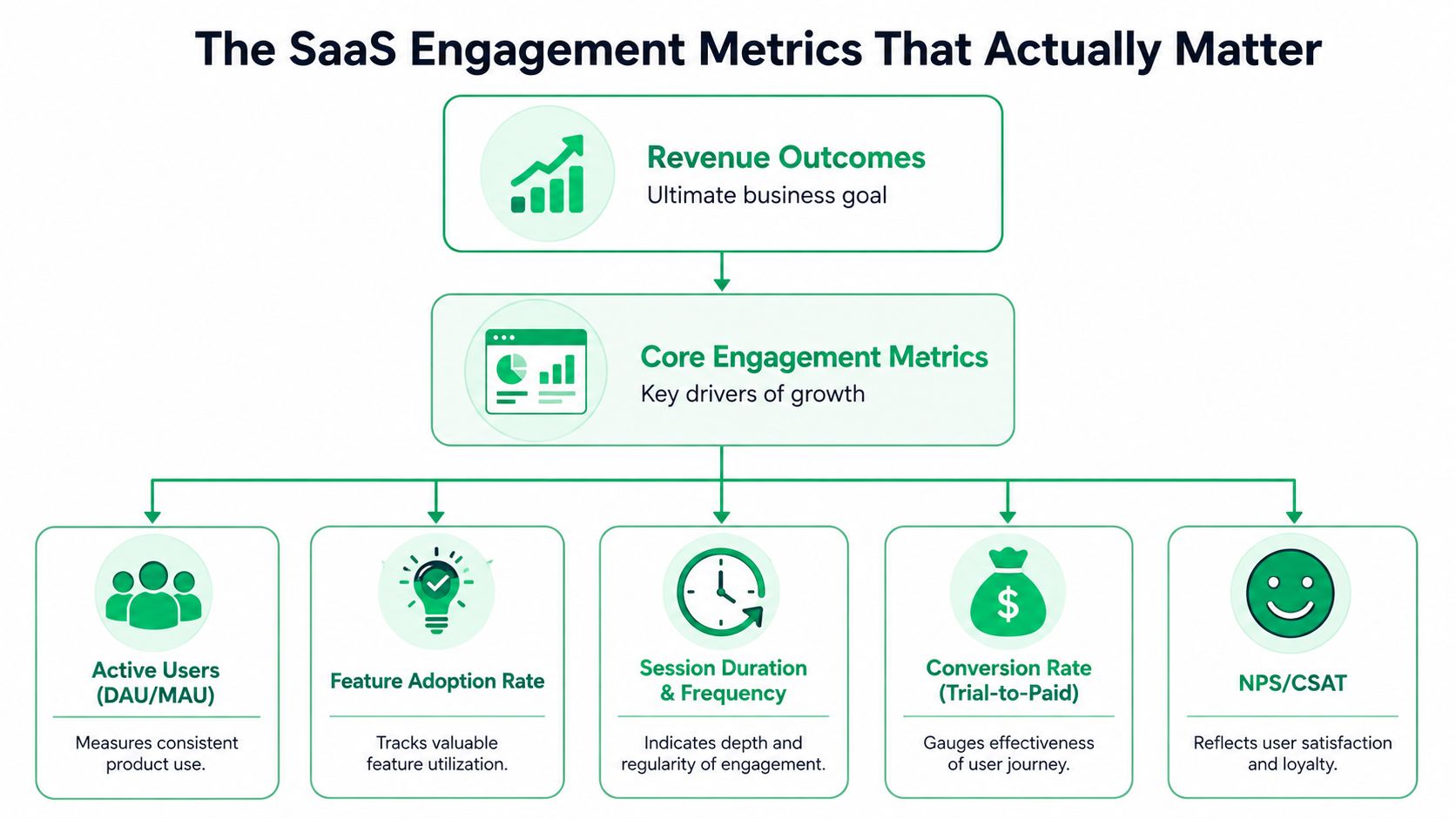
The SaaS Engagement Metrics That Actually Matter
The SaaS teams that use engagement metrics well don't track everything equally. They separate descriptive metrics from predictive metrics. The first group explains what happened. The second group helps you intervene before revenue is lost.
Engagement should predict a business outcome
The cleanest example is Stickiness, measured as DAU divided by MAU. It's a rigorous proxy for product habituation. In SaaS, a benchmark of 20% is described as a critical threshold for high-growth viability, and cohorts with stickiness above 0.20 show 30 to 40% lower voluntary churn. The same guidance notes that a 5% drop in stickiness over a 30-day period can act as a leading indicator of involuntary churn risk, while optimization of stickiness correlates with a 15% increase in CLV. Those details matter because they turn “usage is down a bit” into an operational warning with financial implications.
A second high-signal metric is the Customer Engagement Score, or CES. Done well, it's not a vanity composite. It's a weighted model built from behaviors that correlate with retention, such as logins, feature usage, session duration, and goal completion. The important point isn't the acronym. It's the ability to see risk before the customer tells you directly. According to the verified guidance, a 10-point drop below cohort average is a leading indicator of cancellation intent with 85% precision, often appearing 14 days before a user initiates a cancellation flow.
The short list that deserves executive attention
You don't need a giant metric catalog. You need a short list with different jobs.
| Metric | What it tells you | Why it matters |
|---|---|---|
| Stickiness | Whether use is becoming habitual | Habit is one of the strongest defenses against churn |
| Customer Engagement Score | Whether an account is drifting from healthy behavior | Useful for early warning and triage |
| Critical feature adoption | Whether users reached the product's real value | Low adoption often means the customer never fully activated |
| Conversion rate | Whether users move to the next step in the journey | Good for onboarding and trial-to-paid friction |
| Session duration and pages per session | Whether users are engaging deeply enough to make progress | Helpful when interpreted alongside product stage |
The mistake isn't tracking broad engagement metrics. The mistake is promoting them to executive metrics before they prove they predict retention or revenue.
One more point matters here. Channel benchmarks aren't interchangeable. Involve.me's benchmark roundup reports that interactive content generates about 52.6% more engagement than static content and keeps buyers engaged 53% longer. The same source says the global email user base reached 4.6 billion in 2025, with average marketing email open rates of 35.6% and click-through rates around 2.6%. For growth teams, that's a reminder that engagement quality varies sharply by format and channel. Passive experiences underperform participatory ones, and even giant channels like email still demand careful optimization.
How to Measure and Instrument Key Metrics
A lot of engagement work fails before analysis starts. The instrumentation is shallow, the event names are inconsistent, or the billing and product data live in separate systems. If that's your setup, your team will spend more time debating definitions than improving retention.
Start with events, not dashboards
Start with a product analytics tool such as Amplitude or Mixpanel. Add a warehouse if you need a shared model across product, billing, and CRM data. The goal isn't a pretty dashboard. The goal is a reliable event stream tied to a user ID and account ID.
Track events that reflect value realization, not just presence. Examples include account creation, first successful workflow, repeated core action, key feature use, support contact, failed payment, invoice recovery, downgrade, and cancellation intent. If a user can touch Stripe, your app, support, and email without a common identity layer, your engagement metrics will break at exactly the point where you need them most.
A clean starting model looks like this:
- Identity events: user created, workspace joined, owner assigned
- Activation events: first project created, first integration connected, first result generated
- Habit events: recurring core action completed, repeat session within expected usage window
- Revenue-risk events: payment failed, plan changed, cancel flow entered
- Recovery events: payment method updated, save offer accepted, reactivation completed
Build a score only if it changes action
Many teams rush into a CES model too early. They pile in logins, clicks, page views, and support interactions, then call it health. That's how you end up with a score nobody trusts.
A better approach is to choose a few behaviors that clearly relate to retention. The verified guidance describes CES as a weighted algorithm built from signals like logins, feature usage, session duration, and goal completion, with weights based on predictive coefficients from historical churn analysis. That's the right logic. Start simple, test against real retention outcomes, and recalibrate over time.
Build the score from behaviors your team can act on. If low score users all get the same generic message, the score wasn't worth building.
Your operating model should answer four questions:
- What event happened
- Which account segment it belongs to
- What level of revenue risk it implies
- What action should trigger next
For churn measurement itself, keep your definition consistent and document it well. If your team needs a clean baseline before adding more advanced engagement metrics, use a shared formula and governance process. A practical reference is this guide to churn rate calculation and formula.
Benchmarks and How to Interpret the Signals
Benchmarks are useful, but only if you treat them as directional context. They don't replace segment-level analysis, and they don't tell you what to do by themselves.
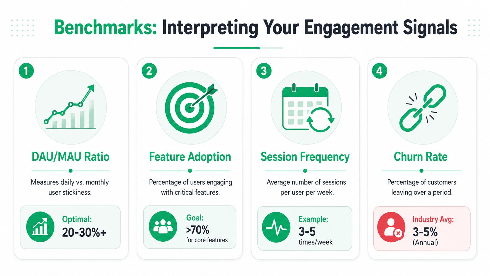
Benchmarks are context, not targets
A benchmark only helps if the comparison is fair. B2B products with weekday usage patterns behave differently from consumer apps. New cohorts behave differently from mature accounts. High-touch enterprise plans don't look like self-serve plans. If you compare all of them together, the average will hide the accurate picture.
That's why I prefer three comparison layers:
| Comparison layer | Best use |
|---|---|
| Against an external benchmark | Sense-check whether your channel or format is broadly weak or strong |
| Against your own historical cohort | Detect drift earlier than aggregate reporting |
| Against similar segments | Find misalignment by plan, lifecycle stage, or account value |
The external benchmark example that's actually useful for growth teams is format choice. As cited earlier from Involve.me, interactive content outperforms static content on engagement and time spent. That doesn't mean every team should build quizzes. It means participatory experiences usually produce stronger signals than passive pages. If your cancellation flow, onboarding, or payment recovery path is static, don't be surprised when users skim past it.
How to read movement instead of snapshots
The more important skill is interpretation. A single reading can be noisy. A directional change across a defined cohort is usually more useful.
Here's how to read common signals:
- Stickiness declines in a healthy cohort: check whether users are failing to complete the recurring action that anchors product habit
- CES drops in high-value accounts: review which weighted behaviors changed, then decide whether the issue is onboarding, product friction, support, or billing
- Session depth rises but retention doesn't: users may be searching for answers, not getting value
- Conversion improves while post-purchase engagement weakens: acquisition is outpacing activation quality
A good dashboard doesn't just show a dip. It tells an operator which cohort to inspect and which playbook to run.
If you care about recurring revenue quality, don't stop at engagement trends. Pair them with revenue outcomes by cohort. Net revenue retention is often the better lens for understanding whether behavior shifts are affecting expansion, contraction, and churn in aggregate. This overview of net dollar retention is useful for that conversation.
Actionable Playbooks for Engagement Signals
Most companies stop at alerting. They detect a risk signal, drop it into Slack, and hope someone follows up. That's not a playbook. It's a wish.
The practical move is to map each engagement signal to a specific intervention, owner, timing rule, and success metric. If you skip that mapping, your engagement metrics stay observational.
Map the signal to the intervention
Different signals call for different responses. A generic save offer usually underperforms because it ignores context.
Consider this operating model:
- Falling stickiness in a self-serve cohort: trigger in-app guidance that pulls users back to the core recurring workflow, not a discount
- Low critical feature adoption after onboarding: route the account to education, templates, setup help, or customer success outreach
- CES decline in a high-value account: send the account to a human path first, because the likely payoff justifies it
- Cancellation intent with active usage: offer pause, downgrade, or use-case-specific support before cancellation
- Failed payment with healthy product engagement: prioritize fast card-update paths and coordinated reminders because the customer may still want the product
Those examples share one principle. The intervention fits the likely cause of risk.
What works better than a generic cancel flow
The cancellation moment is where many growth teams waste their best signal. A default cancel page treats every user the same. That ignores plan level, usage pattern, billing state, stated reason, and account value.
A stronger design ties engagement metrics to routing rules. If an account still shows meaningful product use, a pause or downgrade may make more sense than a blunt retention discount. If the account shows weak adoption and repeated friction, the better move may be to collect a reason cleanly and preserve goodwill. If the issue is billing, the response should focus on recovery, not persuasion.
A useful playbook should define:
- Signal threshold that starts the workflow
- Segment logic based on plan, value, lifecycle stage, or billing state
- Offer or intervention matched to the likely job to be done
- Owner if a human needs to step in
- Measurement tied to recovered MRR, not just click rate
In this domain, Heads of Growth often need to work closely with RevOps and Product. The best engagement metrics aren't just marketing inputs. They're orchestration triggers.
Unifying Your Revenue Recovery Loop with Revcover
The hard part isn't collecting signals. The hard part is closing the loop across cancellation intent, payment failure, customer feedback, and downstream follow-up. Typically, teams split those jobs across a billing tool, a survey form, a CRM, a support queue, and a spreadsheet. That setup guarantees lag.
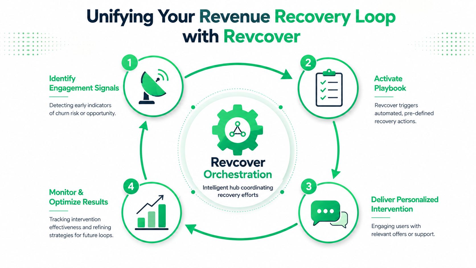
One system beats disconnected tools
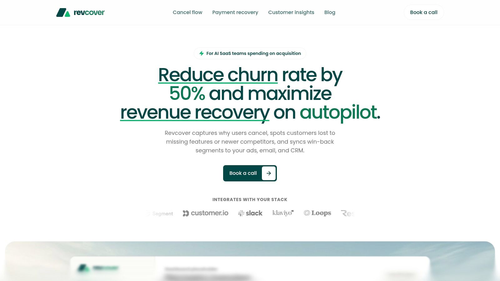
Revcover is designed for subscription software businesses that want one revenue recovery loop instead of separate processes. It connects to Stripe, operates alongside Stripe Billing as the source of truth, and helps teams intercept cancellation intent, coordinate save offers, and handle failed-payment recovery in the same operating layer. You can see the platform at Revcover's product site.
That matters because churn risk usually doesn't arrive in one clean category. A customer may show declining usage, enter a cancellation flow, mention a missing feature in freeform feedback, and then hit a payment issue weeks later. If each event sits in a different tool, no one sees the full account story.
How the loop closes in practice
A unified loop looks like this in practice:
- At the point of intent: the system captures churn reasons inside the product, then routes the user based on plan, usage, account value, stated reason, or billing state
- During recovery: save-paths can vary by context, including pause, downgrade, discount, support handoff, sales handoff, or a clean cancellation
- For involuntary churn: payment recovery coordinates retries, reminders, direct card-update paths, and access control when needed
- After the event: reporting ties accepted offers, abandoned sessions, reasons, and recovered revenue into one dashboard
- Across teams: alerts and syncs can push high-value signals into Slack, CRM, ads platforms, or email tools for follow-up and win-back
The value of a recovery system isn't that it blocks churn. It's that it tells you which intervention worked, for which segment, and what revenue was saved.
That feedback loop also improves product decisions. When freeform churn reasons are clustered with revenue context, product and success teams can prioritize issues by actual business impact instead of volume alone.
Common Pitfalls and How to Get Started
Most engagement metric programs fail for boring reasons. The team tracks too much, segments too little, and treats reporting as progress. Then the dashboard grows while the operating model stays vague.
The mistakes that keep teams stuck
The first mistake is treating engagement as a static dashboard problem. That's the pattern newer guidance pushes against. Contentsquare's guidance on user engagement metrics emphasizes contextual, action-linked engagement and argues that the strongest signal comes from measuring the smallest set of behaviors that predicts revenue outcomes, then testing those behaviors against cohorts or experiments instead of reporting vanity metrics.
The second mistake is using one score for every job. A metric that helps onboarding may be useless for save-flow routing. A signal that works for self-serve accounts may mislead you in enterprise. Segment by lifecycle stage, account value, and risk state, or your averages will hide your best opportunities.
The third mistake is rewarding visibility over action. Teams often celebrate email opens, feature clicks, and content consumption because those are easy to improve. But if those gains don't translate into better retention, lower churn, smoother payment recovery, or stronger expansion, they're not growth metrics. They're activity metrics.
A practical starting point
Keep the first version narrow.
- Pick one engagement metric that you believe predicts a revenue outcome. Stickiness is often a strong starting point.
- Instrument the events behind it with clean identity mapping.
- Establish a baseline by cohort, not just company-wide.
- Define one intervention for one negative signal.
- Measure whether that intervention changes retained or recovered MRR.
Don't build a giant framework on day one. Build one reliable loop, prove that it works, and expand from there. That's how engagement metrics become an operating system instead of a reporting ritual.
If your team wants to turn cancellation intent, failed payments, and product engagement signals into a measurable recovery program, Revcover gives you the orchestration layer to do it. It connects to Stripe, routes users into context-aware save paths, coordinates payment recovery, captures churn reasons, and ties outcomes back to recovered MRR so your growth, RevOps, and customer teams can improve what moves revenue.